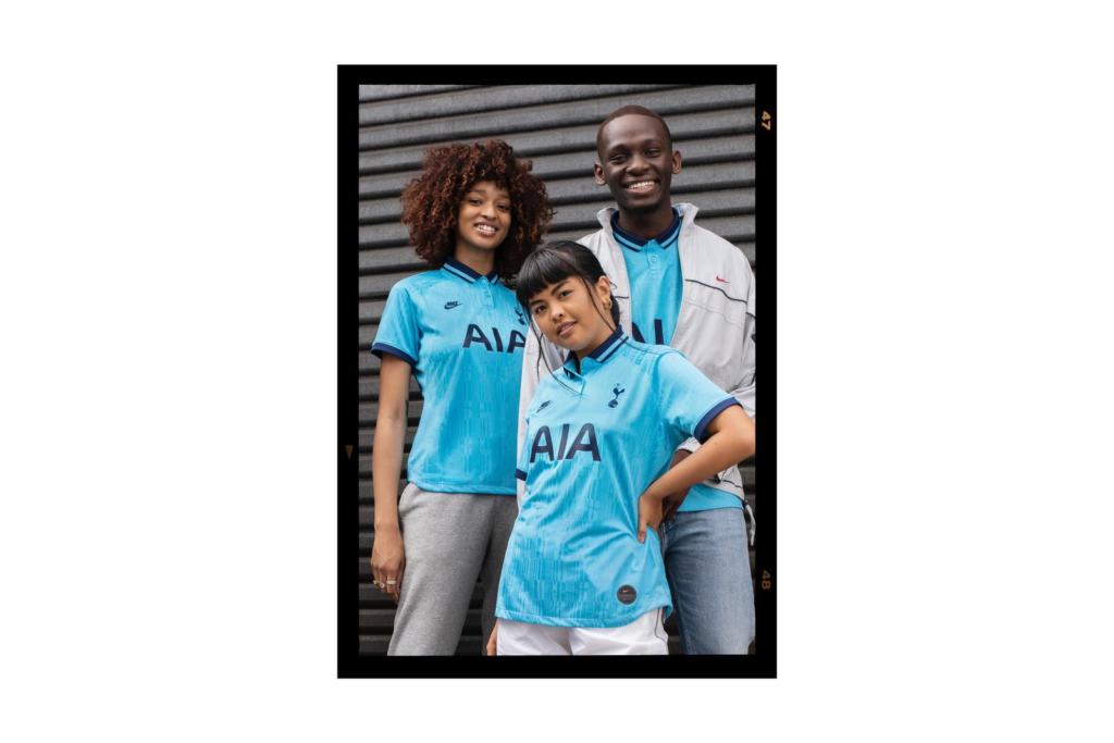
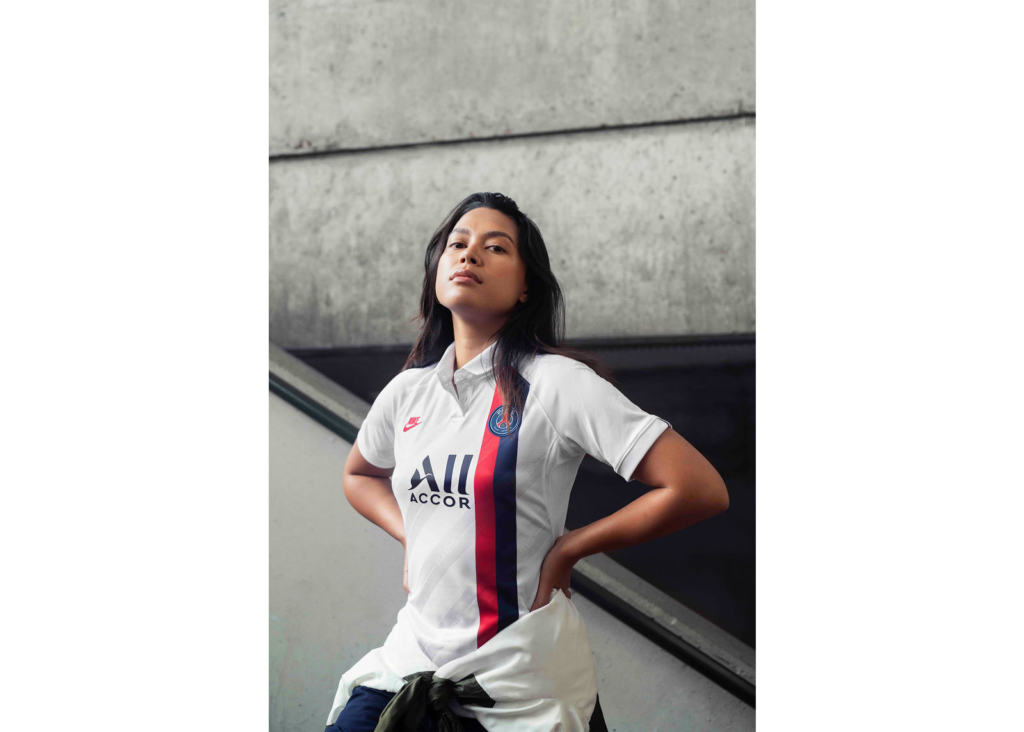
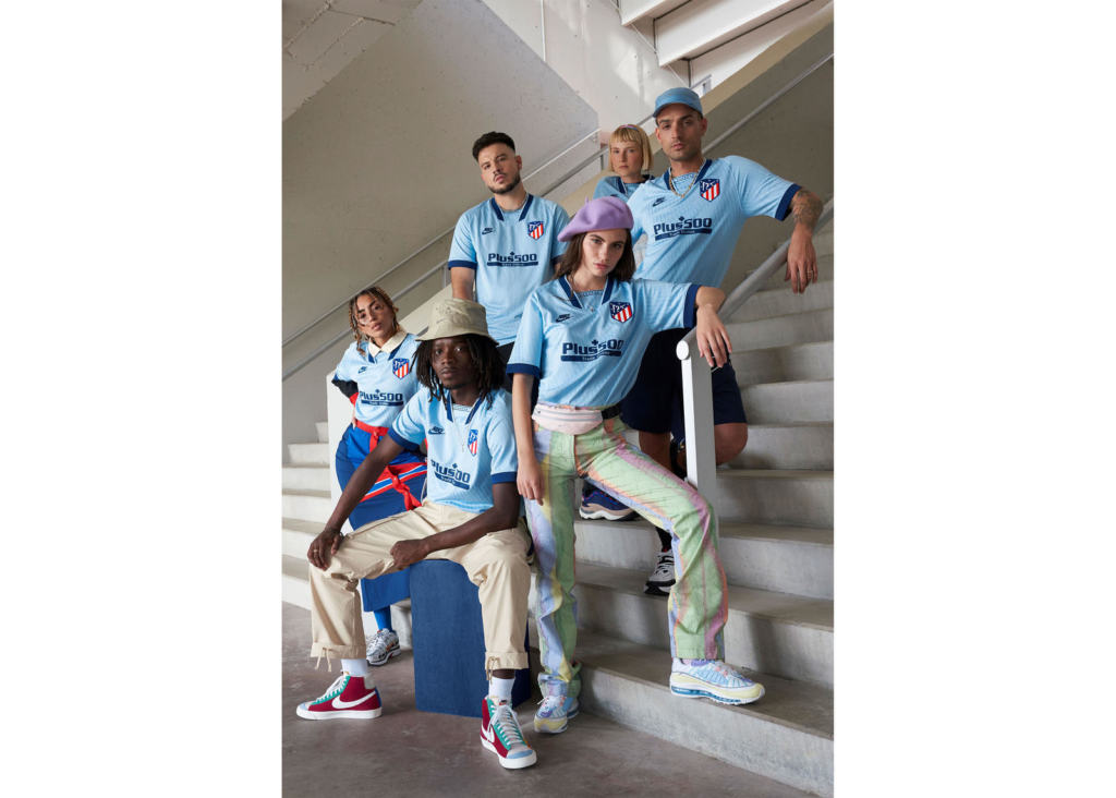
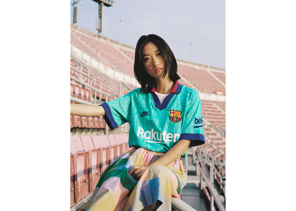
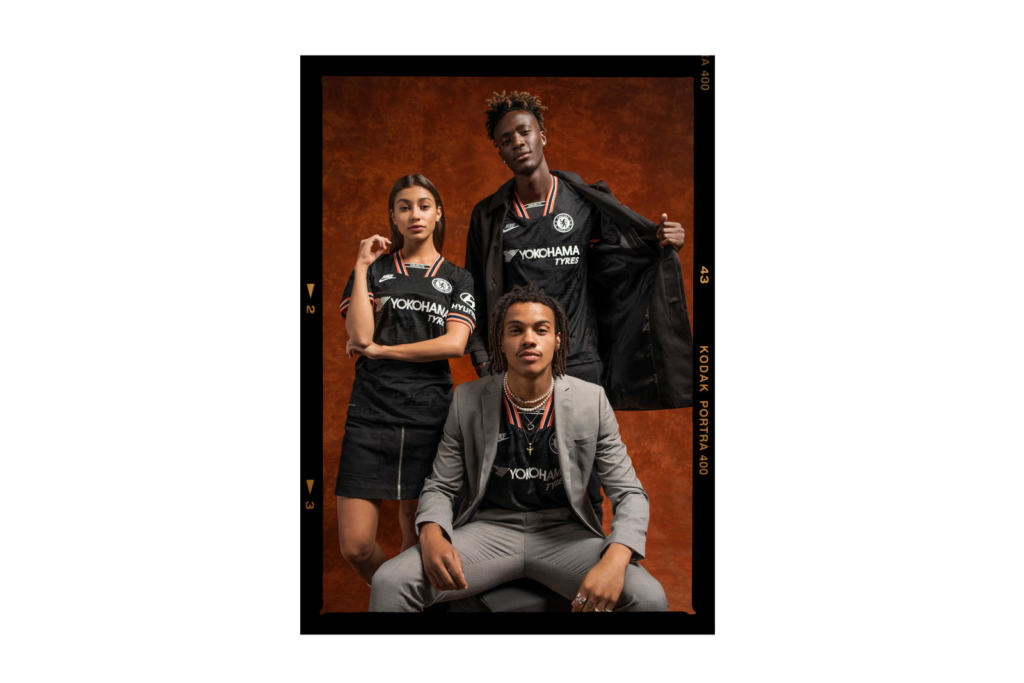
Attractive designs, stylish details, surprising aesthetic solutions. At Undici we have said it many times: football shirts are experiencing a new golden age. Among the best of season 2019/20, there are certainly the third shirts made by Nike for Inter, Roma, Barcelona, Atlético Madrid, Tottenham, Chelsea and Psg. We’re talking about kits inspired by the aesthetics of the late 80s-early 90s – through the recovery of graphic elements and details and through direct references to shirts worn by clubs in the past. We asked Pete Hoppins, Nike Football Apparel Senior Design Director, to tell us about it.
Ⓤ In the design process of the third kits, you were inspired by 1990s football aesthetics. Why did you adopt this approach?
Sports and vintage sports looks have become increasingly influential in streetwear and that certainly played its part in some of the jersey designs we produced this season. I think the late 1980s through the early 1990s was a golden era for football jersey design. Those kits were loaded with details which gave them so much soul; things like jacquard fabrics, chunky collars, crazy necklines, rich embroidery and crest applications. We wanted to take those soulful details but apply them in a modern way which wouldn’t compromise performance on the pitch.
Ⓤ The retro shirt market is becoming increasingly important, how decisive was this trend in the process?
Yes, it seems that jersey culture is here to stay. Nike has been a pioneer of kit design ever since we got involved in football. We have set trends along the way and, inevitably, today’s innovation is tomorrow’s retro. It means we have a substantial archive to delve into for design inspiration and I think that really manifests in this season’s collection.
Ⓤ What are the main elements – taken from the past – featured in the 2019/20 third kits?
Typically, Nike is a forward thinking brand, so while there are nostalgic touches this year, they garnish what is still a high performance jersey. But, as you can see with the collection, it’s things like patterns within the fabric, cool collars, sleeve details and, of course, the return of the vintage Nike Futura logo.
Ⓤ In past seasons, third kits were an opportunity to break away from tradition. This year, it’s a different concept – was this a specific request from clubs?
No, not particularly. We always like to come with a holistic concept for our third jerseys and this one was no different in how we planned it. I just think that the timing was right. We always want to take the fans somewhere new, and retro jerseys for Nike is something new. This wouldn’t have worked a few years ago as Nike jerseys hadn’t been around for that long. Now that the fans who grew up in the 1990s are older, those reference points have more meaning.
Ⓤ Did you work directly with the clubs?
Yes, we work directly with clubs, and each relationship is completely different; unlike in American sports where you singularly work with the whole league. Some teams are really easy to work with and trust us implicitly to do what we feel is the right design, while others are more conservative. First of all we have our own internal Nike Design reviews to go through, then when we are happy we go to the club and the club either approves or rejects the designs. Most of the time it’s somewhere in between with some minor changes. Occasionally, the club will brief us with a specific story or anniversary that needs to be commemorated.
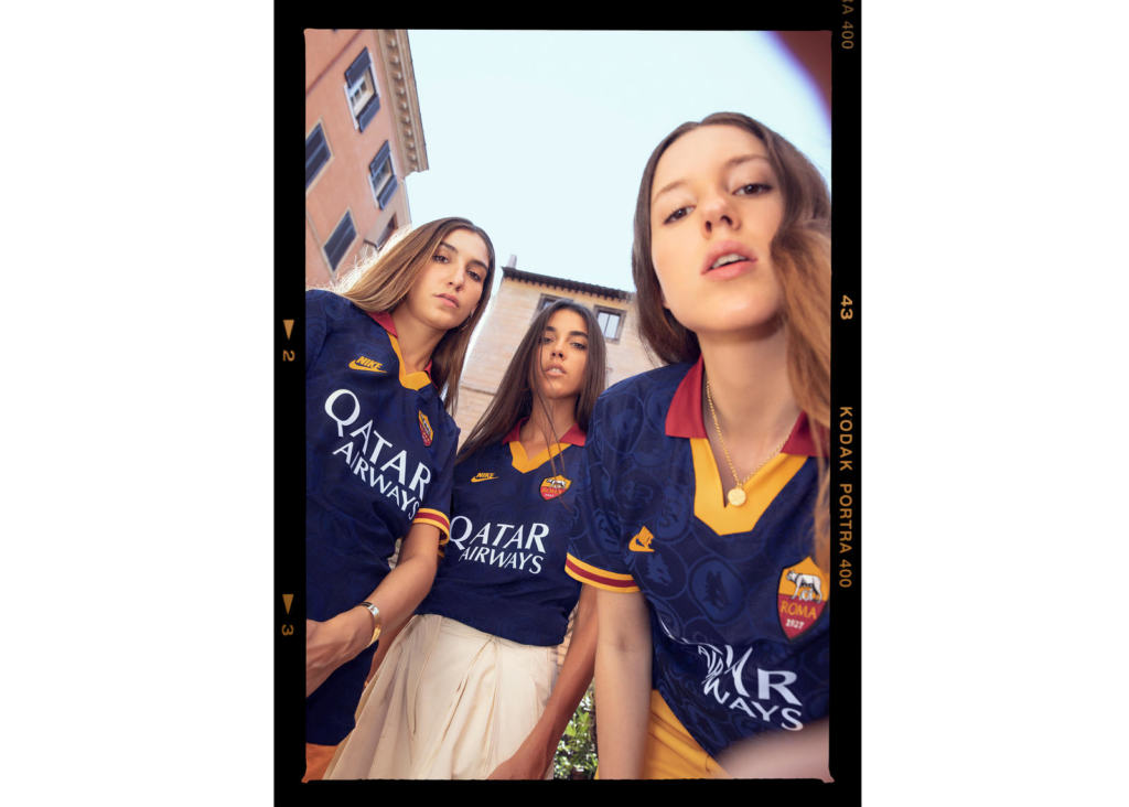
Ⓤ Let’s talk about Italian clubs, Roma and Inter – both have very interesting third kits. Roma is brilliant, and it’s inspired by a shirt worn just once in history. Why did you choose that kit?
Yes, the Roma one is beautiful and probably the most retro looking out of all the 2019-20 third kits. Roma has a very minimal colour pallet throughout club history so it was important to respect that and find a colour that was used in the past, somewhere in the late 80’s and early 90’s, and so that’s why we landed on that particular jersey as a reference. We liked this concept of ‘future heritage’; what would the kits of the past look like today? It’s a fun design brief for us to think that way, especially when we didn’t manufacture that team’s kit back then. So we asked the question, what would a Nike kit have looked like back in that era and which elements we would have brought forward into 2019?
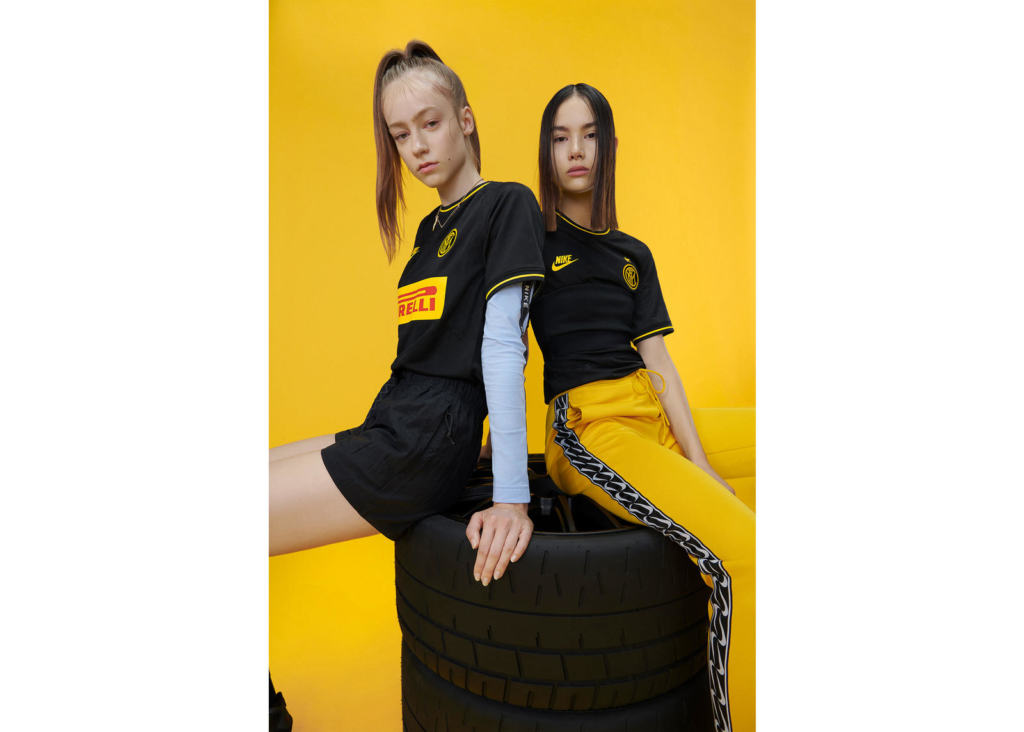
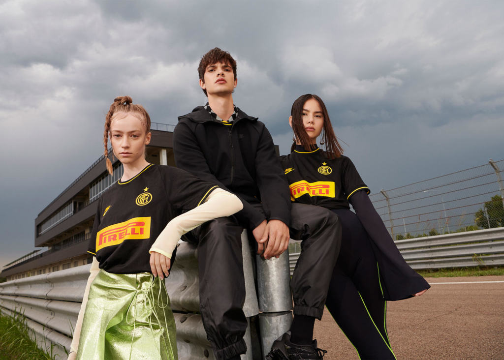
Ⓤ The Inter shirt is striking but unlike the other shirts it doesn’t have a strong link with the past. It reminds me more of motorsports. Is there a particular reason?
Absolutely, you are 100 per cent correct. For sure, the Inter kit feels more modern than the other jerseys, even though it nods to the past through the jacquard pattern technique. Throughout the design process, our designer landed on this black with yellow trim design that was inspired by the Pirelli test car. Inter has one of the most iconic jersey sponsors and we wanted to celebrate that by playing up that box logo version you see on the car. This gives the jersey a strong streetwear style that really hits the mark with the fans.
Ⓤ Football shirts are improving in lifestyle and fashion sense – do you think these third kits fit this mood?
Yes, for sure. We take into account how our jerseys look when worn as a lifestyle product as well as on the pitch. But I think jerseys as a fashion item is something that’s become part of a bigger football inspired movement that combines all elements of football, fashion, music and cultural expression.
Ⓤ Should we expect similar third kits in the coming years?
Ha! We’ll keep you guessing. That’s the fun part of this job.